
TL;DR

Get coffee and tea gear delivered free with Prime
- Fast, free delivery on millions of items
- Prime Video, Amazon Music and more included
- Member-only deals all year
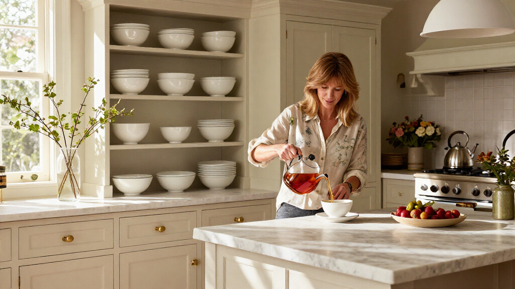
Ina Garten’s kitchen-design advice, reported by Good Housekeeping, is to choose a small color palette for items on display, such as white china and silver. The approach can make existing dishes and accessories look more cohesive without requiring a renovation or a new matching set.
Ina Garten’s kitchen-style advice is to choose a small color palette for the dishes and accessories on display, a simple approach that can make a kitchen feel more cohesive without replacing cabinets or buying a matching set. In a post on her Substack, the Barefoot Contessa suggested white china and silver as one classic combination, according to a Good Housekeeping report.
The idea is to bring visual consistency to the items that are already out in the kitchen. Rather than changing the whole room, homeowners can select a few compatible colors for serving pieces, cookware or other accessories on open shelves and counters. Garten’s example is white and silver, but the principle can be adapted to other combinations that suit a home’s existing finishes and personal style.
Good Housekeeping notes that a limited palette may be practical for people who replace kitchenware gradually, when an item breaks or wears out. Pieces do not have to match exactly: the report says a mix of shapes, materials and undertones can still look considered when the overall colors work together. Open shelving and glass-fronted cabinets offer ways to show the collection, though the advice does not require either feature.
Garten also recommends varying the arrangement. The report quotes her suggesting that people place different shapes and heights together rather than lining up only bowls or only flat plates. A platter leaned against a wall, a stack of cookbooks or a wireless table lamp can add height and variation to a display. These are examples of styling options, not requirements for following the color-palette tip.
A Cohesive Look Without Renovation
The advice is relevant to readers who want a more coordinated kitchen but are not planning a remodel or a full replacement of their dishes. Focusing on a few visible objects makes the suggestion low-cost and adaptable: people can start with what they own and consider palette choices only when adding or replacing pieces.
A restrained color scheme can also make individual items easier to combine over time. That is especially useful when kitchenware is bought in stages rather than as one complete set. The report’s point is not that every piece must be identical, but that a shared palette can help a varied collection feel intentional rather than cluttered. Whether that result works will depend on the room, the objects displayed and the homeowner’s taste.
As an affiliate, we earn on qualifying purchases.
Garten’s Display Advice
The Good Housekeeping report presents the tip as part of Garten’s broader approach to kitchen displays, drawing on advice from her Substack. It also points to examples in her Instagram feed, where the publication says creamy cookware and muted bowls appear alongside silver cake stands and pitchers. That observation is the report’s description of her posts; it does not establish that every item in Garten’s kitchen follows one fixed scheme.
Garten’s other guidance, as quoted in the report, is to display dishes and trays that are both useful and loved, and to combine old and new pieces. Her suggested arrangement includes objects of different shapes and heights. Together, these ideas frame the palette as a starting point for a personal display—not a demand to buy particular brands, replace existing pieces or copy Garten’s kitchen exactly.
Details the Report Does Not Specify
The supplied report does not state when Garten published the original Substack post, and it provides no direct link to that post beyond its quoted advice. It also does not establish that a limited palette will make every kitchen look timeless; that is a design judgment rather than a measured outcome. White and silver are an example, not a stated rule for all kitchens, and the report offers no product list, budget estimate or specific recommendations for choosing finishes.
How to Apply the Palette
For readers interested in trying the idea, the report’s practical next step is to look at the items already visible in the kitchen, identify a small group of colors that works with them, and arrange pieces with varied shapes and heights. New purchases are not necessary to begin. The source does not announce a follow-up from Garten or a formal design project; its advice remains a flexible styling suggestion readers can adapt to their own kitchens.
Key Questions
What is Ina Garten’s kitchen design tip?
She recommends choosing a small color palette for kitchen items on display. Her example is white china and silver.
Do the dishes and accessories need to match?
No. The report says a collection can include different shapes, materials and undertones, as long as its overall palette feels cohesive.
Does this tip require buying new kitchenware?
No. The approach can begin with pieces already in the home. The report describes it as a way to coordinate visible items without replacing cabinets or purchasing a whole new set.
How does Garten suggest arranging displayed pieces?
She recommends mixing shapes and heights rather than grouping only one type of item. The report also gives examples such as leaning a platter against a wall or adding a stack of cookbooks.
Source: rss
Halloween Picks
halloween
As an affiliate, we earn on qualifying purchases.